Data Visualisation

What is Data Visualisation and Why Should We Use It?
Why would you want to visualise your data? Your campaign may have provided you with some interesting insights you want to share with a larger audience. You might want to use your results for further projects and advocacy. Or perhaps you have collected data that can help change the debate in a community around a particular social issue. How you present your data can make a big difference in how effectively you communicate your message.
Data visualisation is the graphical representation of data, that helps to understand that data faster. There are a number of reasons why we should use data visualisations:
- Speed: your audience can understand the data faster
- Comprehension: your audience can get a more enhanced and complete view of your data
- Appeal: your data is more appealing to your audience
- Retention: your audience can remember the data more easily
| When we read text alone, we are likely to remember only 10 percent of the information 3 days later. If that information is presented to us as text combined with a relevant image, we are likely to remember 65 percent of the information 3 days later. Known as the picture superiority effect, the phenomenon applies to any visual display, not just images. Therefore, people are also more likely to remember concepts when they are presented to them as charts and graphs rather than as words. Sources (1, 2) |
Tips for Good Data Visualization
What makes a good data visualisation? There are some guidelines to keep in mind, when visualising your data:
| Target audience: For who is the message intended and what do you want your target audience to do with the new insight? Be aware of the level of knowledge of the target audience in order to make sure they understand the message you intend to communicate. Purpose: What is the purpose of your visualisation? Is it to analyse a data set or to communicate a message? Graphics for communication have one message, for analysis it can be multi-layered. Message: What is your key message? What do you want to show? Difference, achieved results? Use the appropriate chart and draw the attention to the key message using highlights, text, numbers and descriptive graphics. Medium: How will your visualisation be read? Whether the message is read on paper or digitally, on a phone or laptop, can affect the design. Focus: Keep it simple, remove text, backgrounds, colours if they do not have a specific purpose. Type of graphic: use the appropriate graphics and explore all options. (Source) |
When choosing your graphic, there are some considerations to keep in mind. The information below is based on https://deperfectegrafiek.nl/ and https://chart.guide/. This chart provides suggestions for types of graphics you can use, based on purpose. It also highlights some tips and mistakes to avoid when making a chart.
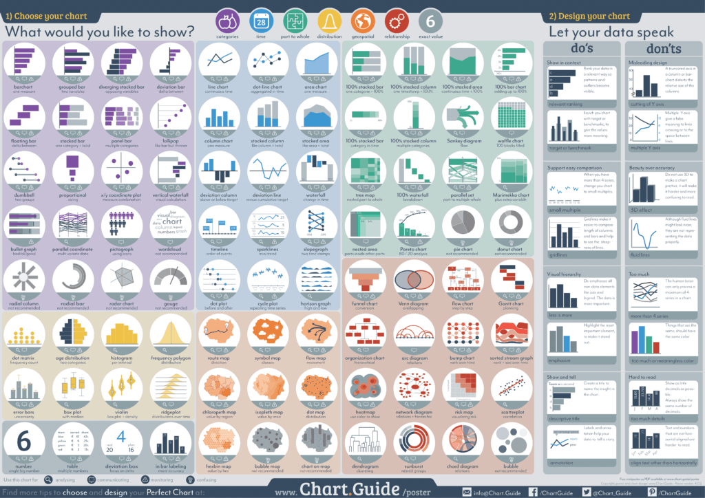
What is the purpose of your graphic? The chart guide has grouped a number of different graphics depending on their use, or type of relation “you would like to show“, namely:
- Categories: comparison between categories A and B, comparing nominal data at one moment in time
- Time: change of category A and B over time
- Part to whole: how A, B and C add up to the total of ABC
- Relationship or hierarchy: how A, B and C relate to each other
- Geospatial: where your data points are located on a map
- Distribution: how often A, B and C appear in the dataset
There are many data visualisation resources online, which can help you understand some key basics of data visualisation.
- Pace toolkit on data visualisation
- Storytelling with data: some interesting 30 min videos on use of colour, contrast and “decluttering your data”
- Data visualisation linked to advocacy: This website contains numerous resources (although not most recent) related to data visualization and guidelines to help human rights advocates use data visualization more effectively.
- Finding the right colour palette
- Depict data studio: How to Tell a Story with Data: Titles, Subtitles, Annotations, Dark/Light Contrast, and Selective Labelling
- Edward Tufte, a statistician, artist, and Professor Emeritus of Political Science, Statistics, and Computer Science at Yale University. He wrote, designed, and self-published 4 classic books on data visualization
- ‘How Charts Lie’
- Visualising Data
- Your Guide to Great Graphs
- Visualising Data for Human Rights Advocacy
Exercice: Create your own data visualisation of the results from your campaign. You can follow the tips below.
1. PLAN:
- Take a recent data set you have worked with or a recent research report.
- Based on the data set, define your data visualisation plan:
- What is the topic you want to cover in your visualisation?
- Who is your target audience?
- What is your message?
- What type of graph can you use to convey your message?
- How will you use text, colours and highlights in your data visualisation?
2. CREATE: You can use any programme you like (for example Word, Excel or PPT) or draw it by hand.
- Alternatively: Instead of creating a new visualisation, improve an existing visualisation of a recent publication. Review the visualisation against the criteria and tips mentioned.
- Is the message clear? Could you use another graph to better convey the message? Is the use of colours and highlights enhancing the message? Check it against the do’s & don’ts of the https://chart.guide/.
3. CHECK: Share your data visualisation with a coworker, or better yet, representative of your target audience. Do they understand the message you intended to put across? Remember that data visualisation should clearly represent the data. A graph or chart without data, is not data visualisation.